<!DOCTYPE html>
<html lang="en">
<head>
<meta charset="UTF-8">
<title>CSS3點擊按鈕圓形進度打鉤效果</title>
<!--圖標庫-->
<link rel='stylesheet' >
<!--核心樣式-->
<link rel="stylesheet" href="css/style.css">
</head>
<body>
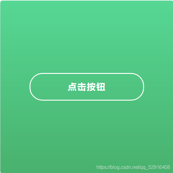
<div class="background">
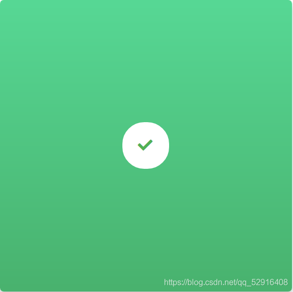
<input type="checkbox" id="button">
<label for="button" class="button"> 點擊按鈕<i class="fas fa-check"></i></label>
<svg class="circle">
<circle cx="32" cy="32" r="31">
</svg>
</div>
</body>
</html>
body {
	margin: 0;
	height: 100vh;
	width: 100vw;
	display: flex;
	align-items: center;
	justify-content: center;
	font-family: "Lucida Sans Unicode", "Lucida Grande", sans-serif;
	font-size: 14px;
}

.background {
	position: relative;
	background: linear-gradient(to top, #49b26e 0%, #57d895 100%);
	border-radius: 5px;
	display: flex;
	align-items: center;
	justify-content: center;
	flex-direction: column;
	box-shadow: 0 5px 15px 0 rgba(0, 0, 0, 0.25);
	width: 400px;
	height: 400px;
	color: white;
}

.background input {
	display: none;
}

.background .button {
	display: flex;
	justify-content: center;
	align-items: center;
	width: 260px;
	height: 60px;
	border: 2px solid white;
	border-radius: 30px;
	text-align: center;
	font-size: 20px;
	text-transform: uppercase;
	font-weight: bold;
	letter-spacing: 2px;
	transition: all 0.3s ease-in-out;
	cursor: pointer;
}

.background .button:hover {
	background-color: #37be77;
}

.background .button .fas {
	position: absolute;
	color: #4caf50;
	z-index: 2;
	opacity: 0;
}

.background .circle {
	position: absolute;
	width: 65px;
	height: 65px;
	fill: none;
	stroke: white;
	stroke-width: 2px;
	stroke-linecap: round;
	stroke-dasharray: 183 183;
	stroke-dashoffset: 183;
	opacity: 0;
	left: 0;
	bottom: 0;
	right: 0;
	top: 0;
	margin: auto;
	pointer-events: none;
	transform: rotate(-90deg);
}

.background input:checked~.button {
	animation: button 0.5s ease both, fill 0.5s ease-out 1.5s forwards;
}

.background input:checked~.button .fas {
	animation: check 0.5s ease-out 1.5s both;
}

.background input:checked~.circle {
	animation: circle 2s ease-out 0.5s both;
}

@keyframes button {
	0% {
		width: 260px;
		left: 70px;
		border-color: white;
		color: white;
	}

	50% {
		color: transparent;
	}

	100% {
		width: 60px;
		left: 170px;
		border-color: #45b078;
		background: transparent;
		color: transparent;
	}
}

@keyframes circle {
	0% {
		stroke-dashoffset: 183;
	}

	50% {
		stroke-dashoffset: 0;
		stroke-dasharray: 183;
		transform: rotate(-90deg) scale(1);
		opacity: 1;
	}

	90%,
	100% {
		stroke-dasharray: 500 500;
		transform: rotate(-90deg) scale(2);
		opacity: 0;
	}
}

@keyframes fill {
	0% {
		background: transparent;
		border-color: white;
	}

	100% {
		background: white;
	}
}

@keyframes check {
	0% {
		opacity: 0;
	}

	100% {
		opacity: 1;
	}
}
到此這篇關于CSS3點擊按鈕圓形進度打鉤效果的文章就介紹到這了,更多相關css3圓形進度按鈕內容請搜索腳本之家以前的文章或繼續(xù)瀏覽下面的相關文章,希望大家以后多多支持腳本之家�����!
