要創(chuàng)建一個 flex 容器,只需要將一個 display: flex 屬性添加到一個元素上����。
默認情況下����,所有的直接子元素都被認為是 flex 項,并從左到右依次排列在一行中�。
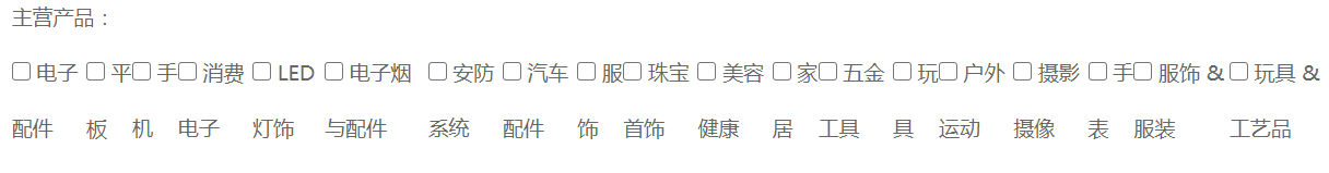
如果 flex 項的寬度總和大于容器,那么 flex 項將按比例縮小�,直到它們適應(yīng) flex 容器寬度 演示: 找一個頁面敲擊f12,找到div內(nèi)多個div的元素組合�,聲明flex 并width:900px;給予定寬好讓后面實踐自動換行的功能
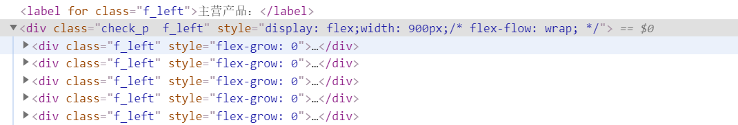
同樣的:通過控制臺的css進行樣式的調(diào)整,如下

得到: 很明顯�, 印證了flex 項將按比例縮小
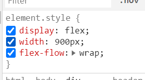
此時我們需要在父元素的加入: flex-flow: wrap; 具體如下
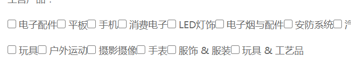
最終效果
更多參考
display: flex;
/* flex-direction 決定主軸的方向 row(默認)|row-reverse|column|column-reverse*/
/* flex-direction: row; */
/* flex-wrap決定當(dāng)排列不下時是否換行以及換行的方式,nowrap(默認)|wrap|wrap-reverse */
/* flex-wrap:wrap; */
/* flex-flow是lex-direction和flex-wrap的簡寫形式,如:row wrap|column wrap-reverse等�。默認值為row nowrap,即橫向排列 不換行 */
flex-flow:row wrap;
/* !當(dāng)主軸沿水平方向時!justify-content,決定item在主軸上的對齊方式�,可能的值有flex-start(默認),flex-end�����,center�����,space-between,space-around */
justify-content:center;
/* !主軸水平時!決定了item在交叉軸上的對齊方式�����,可能的值有flex-start|flex-end|center|baseline|stretch */
align-items:center;
示例:CSS Flex彈性布局(多個div自動換行)
<!DOCTYPE html>
<html>
<head>
<meta charset="UTF-8">
<meta name="viewport" content="width=device-width, initial-scale=1.0">
<meta http-equiv="X-UA-Compatible" content="ie=edge">
<title>Flex布局</title>
<style>
.con {
/* 要創(chuàng)建一個 flex 容器��,只需要將一個 display: flex 屬性添加到一個元素上�。*/
/* 默認情況下,所有的直接子元素都被認為是 flex 項��,并從左到右依次排列在一行中�����。*/
/*如果 flex 項的寬度總和大于容器����,那么 flex 項將按比例縮小,直到它們適應(yīng) flex 容器寬度*/
display: flex;
/* flex-direction 決定主軸的方向 row(默認)|row-reverse|column|column-reverse*/
/* flex-direction: row; */
/* flex-wrap決定當(dāng)排列不下時是否換行以及換行的方式,nowrap(默認)|wrap|wrap-reverse */
/* flex-wrap:wrap; */
/* flex-flow是lex-direction和flex-wrap的簡寫形式����,如:row wrap|column wrap-reverse等。默認值為row nowrap����,即橫向排列 不換行 */
flex-flow: row wrap;
/* !當(dāng)主軸沿水平方向時!justify-content,決定item在主軸上的對齊方式���,可能的值有flex-start(默認),flex-end�����,center��,space-between��,space-around */
justify-content: center;
/* !主軸水平時!決定了item在交叉軸上的對齊方式�����,可能的值有flex-start|flex-end|center|baseline|stretch */
align-items: center;
}
.con > div {
width: 100px;
height: 100px;
background: #8DB6CD;
border: 1px solid black;
margin-left: 10px;
text-align: center;
line-height: 100px;
}
</style>
</head>
<body>
<div class='con'>
<!-- order的值是整數(shù)�����,默認為0,整數(shù)越小��,item排列越靠前 這里只給item1 和item4設(shè)置了order屬性 1跟4排到了最后面��,并且4在1的前面 -->
<div style="order: 2">item 1</div>
<div style="height: 300px;">item 2</div>
<!-- flex-grow定義了當(dāng)flex容器有多余空間時,item是否放大 flex-shrink為縮小 -->
<div style="flex-grow:2">item 3</div>
<div style="order: 1">item 4</div>
<div style="flex-basis:60px">item 5</div>
<div>item 6</div>
<div>item 7</div>
<div>item 8</div>
<div>item 9</div>
<div>item 10</div>
<div>item 11</div>
</div>
</body>
</html>
到此這篇關(guān)于css flex布局超長自動換行的示例代碼的文章就介紹到這了,更多相關(guān)css flex超長自動換行內(nèi)容請搜索腳本之家以前的文章或繼續(xù)瀏覽下面的相關(guān)文章��,希望大家以后多多支持腳本之家����!
