本文主要介紹了html css 圖片掃描儀����,分享給大家��,具體如下:
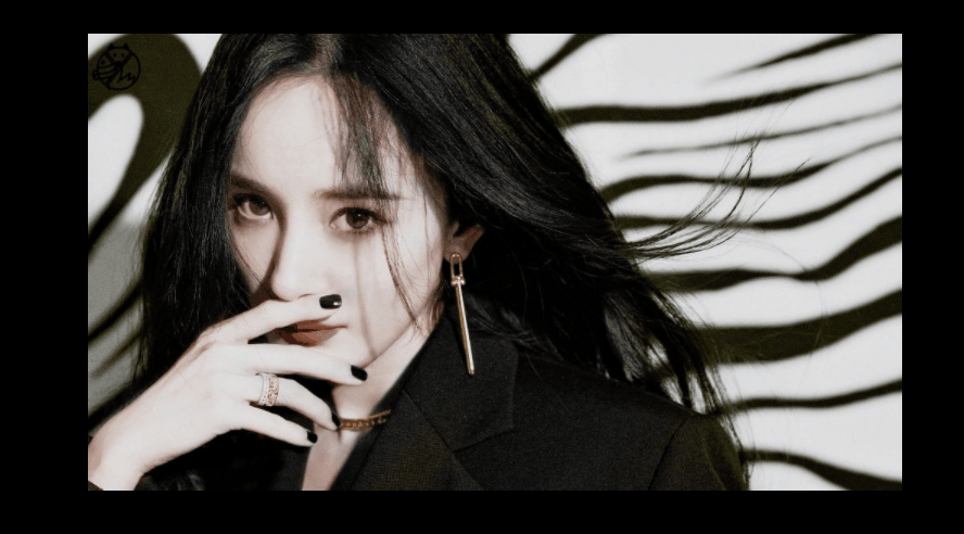
效果:
這樣���,有抖動的:

無抖動的:
實現(xiàn):
1.定義一個盒子:
<body>
    <div class="tu"></div>
</body>
2.基本樣式,長寬背景圖等等~
 .tu{
            width: 500px;
            height: 300px;
            background-image: url(8.jpg);
            background-size: 100% auto;
            background-repeat: no-repeat;
            position: relative;
            overflow: hidden;
            cursor: pointer;
        }
cursor: pointer;鼠標經(jīng)過盒子樣式為小手
3.用偽類元素做掃描線�,基本樣式:
 .tu::after{
            content: '';
            position: absolute;
            top: 0;
            left: 0;
            width: 500px;
            height: 35px;
            background-image: url(8.jpg);
            background-size: 100% auto;
            background-repeat: no-repeat;
            filter: sepia(100%);
            opacity: 0;

        }
filter: sepia(100%); 圖片發(fā)黃��。
filter: invert(100%); 像X光底片����。
4.實現(xiàn)掃描:
.tu:hover::after{
            opacity: 1;
            animation: move 1.8s linear infinite;
        }
        @keyframes move{
            0%{
                top: 0;
                background-position: 6px 0px;
            }
            20%{
                top: 60px;
                background-position: -6px -60px;
            }
            40%{
                top: 120px;
                background-position: 6px -120px;
            }
            60%{
                top: 180px;
                background-position: -6px -180px;
            }
            80%{
                top: 240px;
                background-position: 6px -240px;
            }
            100%{
                top: 300px;
                background-position: -6px -300px;
            }
        }
讓background-position的y軸位移剛好等于top的距離�����,然后x軸為0的話就不抖���,有數(shù)值就會抖動。
完整代碼:
<!DOCTYPE html>
<html lang="zh-CN">
<head>
    <meta charset="UTF-8">
    <meta name="viewport" content="width=device-width, initial-scale=1.0">
    <title>Document</title>
    <style>
        *{
            margin: 0;
            padding: 0;
            box-sizing: border-box;
        }
        body{
            height: 100vh;
            display: flex;
            justify-content: center;
            align-items: center;
            background-color: rgb(0, 0, 0);
        }
        .tu{
            width: 500px;
            height: 300px;
            background-image: url(8.jpg);
            background-size: 100% auto;
            background-repeat: no-repeat;
            position: relative;
            overflow: hidden;
            cursor: pointer;
        }
        .tu::after{
            content: '';
            position: absolute;
            top: 0;
            left: 0;
            width: 500px;
            height: 20px;
            background-image: url(8.jpg);
            background-size: 100% auto;
            background-repeat: no-repeat;
            filter: invert(100%);
            opacity: 0;

        }
        .tu:hover::after{
            opacity: 1;
            animation: move 1.8s linear infinite;
        }
        @keyframes move{
            0%{
                top: 0;
                background-position: 6px 0px;
            }
            20%{
                top: 60px;
                background-position: -6px -60px;
            }
            40%{
                top: 120px;
                background-position: 6px -120px;
            }
            60%{
                top: 180px;
                background-position: -6px -180px;
            }
            80%{
                top: 240px;
                background-position: 6px -240px;
            }
            100%{
                top: 300px;
                background-position: -6px -300px;
            }
        }
    </style>
</head>
<body>
    <div class="tu"></div>
</body>
</html>
總結:
這是網(wǎng)上看到一外國博主的創(chuàng)意,然后自己也弄了一個����,雖然效果是比較簡單的,但也是挺好玩的~
到此這篇關于html+css實現(xiàn)圖片掃描儀特效 的文章就介紹到這了,更多相關html+css圖片掃描儀 內容請搜索腳本之家以前的文章或繼續(xù)瀏覽下面的相關文章,希望大家以后多多支持腳本之家����!
